by Gabriella Mar 01,2025

Civilization VII's Deluxe Edition launched recently, and online discussions are rife with criticism of its user interface (UI). But is the negativity justified? Let's analyze the UI's strengths and weaknesses to determine if the criticism is accurate.
← Return to Sid Meier's Civilization VII main article
Early impressions suggest significant UI shortcomings, alongside other missing features. However, a balanced assessment requires a detailed examination of its components against established 4X UI design principles.
While objective 4X UI design principles exist, the ideal UI is context-dependent. However, common elements contribute to effective 4X interfaces:
Effective UI prioritizes essential information. Frequently used resources and mechanics should be readily accessible, while less crucial elements can be nested within menus. Against the Storm's building menus serve as a strong example, organizing information by relevance and usage frequency.
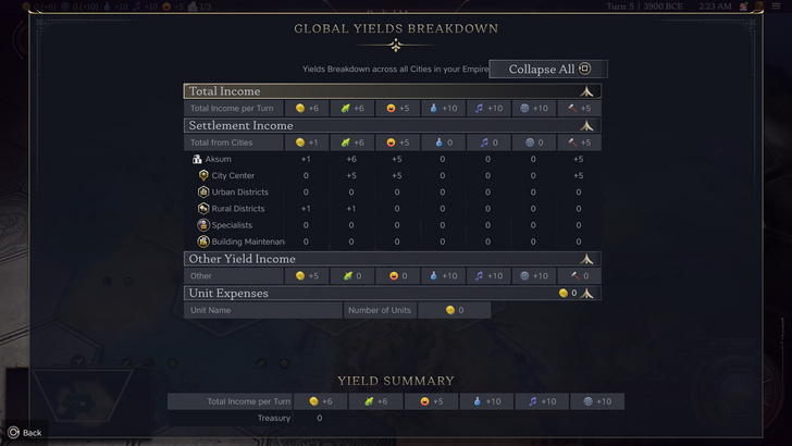
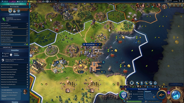
Civilization VII's resource summary displays resource allocation, separating income, yields, and expenses. While well-structured and collapsible, it lacks granular detail. It shows overall resource production from districts but doesn't specify individual districts or hexes. Expense breakdowns are also limited. Therefore, while functional, it could benefit from increased specificity.
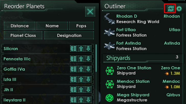
Effective visual indicators convey information instantly. Stellaris's Outliner, despite a cluttered main UI, exemplifies this with clear visual cues for ship status and colony needs.
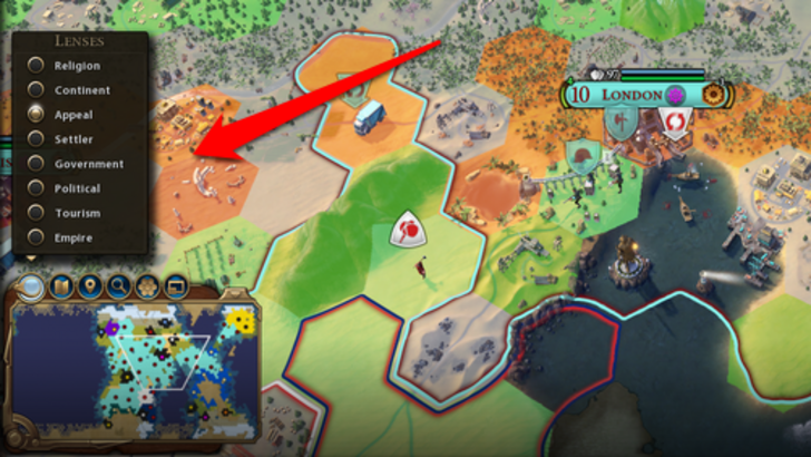
Civilization VII utilizes iconography and numerical data, with effective visual indicators like tile yield overlays and settlement overlays. However, the absence of certain lenses from Civ VI (e.g., appeal, tourism, loyalty) and customizable map pins is a significant drawback.
As complexity increases, search, filtering, and sorting become crucial. Civ VI's robust search function allows players to locate specific resources, units, or features on the map, linking to the Civilopedia for details.
Civilization VII notably lacks this crucial search function, a significant usability issue considering the game's scale. This omission is a major detriment.
UI aesthetics and cohesiveness are vital. Civ VI's dynamic, cartographical style integrates seamlessly with the game's visual identity.
Civilization VII adopts a minimalist, sleek design. While not unattractive, its subtler thematic approach lacks the immediate clarity and visual impact of Civ VI, leading to mixed reactions. This is subjective, but the lack of visual vibrancy is a point of contention.
While Civilization VII's UI isn't perfect, the overwhelmingly negative reception is unwarranted. The missing search function is a significant flaw, but not game-breaking. Compared to other issues, the UI's shortcomings are relatively minor. While it falls short of some competitors, its strengths shouldn't be overlooked. Future updates and player feedback could significantly improve it. The overall game experience compensates for the UI's imperfections.
← Return to Sid Meier's Civilization VII main article

Girls Frontline 2: Exilium Global Website Goes Live, Along With Its Socials!
Marvel Rivals: Understanding Bussing and Catching It
New Game Plus in Assassin's Creed Shadows: Confirmed?
Top Skills to Prioritize for Yasuke in Assassin’s Creed Shadows
Assassin’s Creed Shadows Movements Reviewed by Two Parkour Athletes
Death Stranding 2 Release Date Unveiled in Massive Trailer
Pokemon GO Leak Teases New Adventure Effects
Amazon Music Unlimited: Free 3-Month Trial Available

Charades and other party games - Lexis Pexis
Download
Brain Boom - Tricky Puzzles game, IQ Challenge
Download
Rezident slot safes
Download
Poker Mania
Download
EA Sports FC Mobile 25 (FIFA Fútbol)
Download
MainCraft: build & mine blocks
Download
Red Cherry Slot Machine
Download
Hex Kingdom
Download
Starlight Princess Slot Demo
Download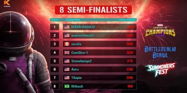
Marvel Contest Semi-Finalists Revealed for Battlerealm Brawl
Apr 25,2026
Endless Grades: Pixel Saga – The Best Tips & Tricks To Boost Your Progression
Apr 22,2026
Foretales: Card Game Shapes Apocalyptic Fate
Apr 20,2026

Once Human: Best Builds for PvE and PvP
Apr 17,2026
Galaxy Defense Fortress TD: Dominate with Strategy
Apr 16,2026
 Category